Color is a key tool in landscape design. It can make people feel certain ways and set the mood in outdoor areas. By knowing about color theory, designers can make gardens and yards that are beautiful and touch the heart.
Using color wisely can change how people see and feel things. Warm colors like red, orange, and yellow make spaces lively and welcoming. They’re great for areas where people gather or for drawing attention to special spots.
Cool colors, such as blue, green, and purple, calm and soothe. They’re perfect for peaceful gardens or quiet spots.
Neutral colors like white, gray, and brown add balance and flexibility. They let other colors shine or stand alone for a clean, simple look. By picking colors carefully and thinking about their emotional effect, designers can make spaces that are not just pretty but uplifting.
Key Takeaways
- Color psychology plays a vital role in creating emotionally resonant landscape designs
- Warm colors energize and grab attention, while cool colors calm and relax
- Neutral hues provide balance and versatility in outdoor spaces
- Strategic color combinations can influence perceptions and behaviors
- Understanding color theory is key to crafting impactful garden designs

The Emotional Impact of Colors in Landscape Design
Colors are key in landscape design, evoking emotions and setting moods. By picking the right colors, designers can create vibrant or calm spaces. It’s all about understanding how colors make us feel.
Warm Colors: Energizing and Inviting
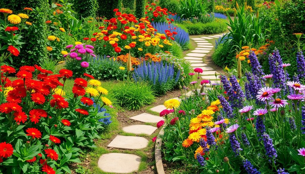
Warm colors like red, orange, and yellow make spaces feel lively and welcoming. They bring out feelings of excitement and warmth. In gardens, warm colors can highlight special areas or spots for gatherings.
Adding bright flowers like tulips, marigolds, and daylilies can instantly brighten a garden. They make it feel more inviting.
Cool Colors: Calming and Relaxing
Cool colors, including blue, green, and purple, bring calm and serenity. They remind us of nature and peace. In gardens, cool colors help create a soothing atmosphere.
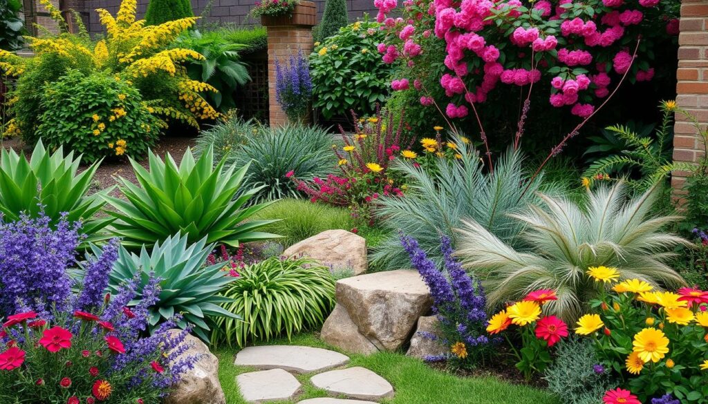
Using plants with blue or purple flowers, like lavender, hydrangeas, and irises, adds to the calm. Green foliage also brings a refreshing feel to the space.

Neutral Colors: Balanced and Versatile
Neutral colors, like white, gray, and brown, support other colors in the landscape. They add balance and versatility. Neutral colors can make a space feel sophisticated and elegant.
Elements like stone pathways, wooden structures, or white fences help create a cohesive look. They bring harmony to the landscape. Read and be enlightened by this insightful article.
Choosing the Right Color Palette for Your Landscape
Creating a stunning landscape design needs careful color scheme planning. Understanding design principles and your preferences is key. This way, you can make an outdoor space that shows off your style and improves the atmosphere.
Choosing colors for your landscape is about setting the mood. Warm colors like red, orange, and yellow energize. Cool colors like blue, green, and purple calm. Neutral colors like white, gray, and beige balance and let you add pops of color.
Knowing color theory basics is important for a good color scheme. The color wheel helps find complementary colors that are striking and opposite. Analogous colors, next to each other, create a softer, more harmonious look.
Your personal taste is crucial in picking colors. Match your home’s style and consider how colors affect your outdoor activities. This could be making a cozy spot or a lively area for parties.
Site conditions and plant choice are also key. Consider sunlight, climate, and soil. Pick plants that do well in your area and add the colors and textures you want. Plants that bloom at different times make your landscape colorful all season.
For a great color scheme, balance your style, nature, and desired mood. Think about these things and try out different colors. This way, you can make your outdoor space a beautiful, welcoming place to enjoy for years.

Color Psychology Landscape Design
Color psychology is key in landscape design, shaping the mood and feel of outdoor areas. By grasping color psychology, designers craft landscapes that stir emotions and improve the experience. This makes outdoor spaces more inspiring and enjoyable.
Understanding the Principles of Color Psychology
The color wheel is the base of color psychology in design. It groups colors by their connections. It includes primary colors like red, blue, and yellow and secondary colors like green and orange. Knowing the color wheel helps designers mix colors for the right mood.
Applying Color Psychology to Landscape Design
In landscape design, color psychology is about the space’s purpose. Warm colors like red and yellow energize spaces, perfect for parties. Cool colors, like blue and green, calm areas, great for quiet spots. Neutral colors, like white and gray, balance and add flexibility, fitting well with other design elements.
Case Studies: Successful Color Schemes in Landscape Design
Real examples show color psychology’s power in design. The Denver Botanic Gardens in Colorado is a prime example. It uses a mix of colors to create a stunning and emotional journey. The Butchart Gardens in Canada also stand out. It guides visitors through themed gardens, each with its own mood.
Seasonal Color Changes and Their Psychological Effects
The colors of the landscape change with each season, taking us on an emotional journey. This journey affects our moods and how we see things. As landscape designers, we must understand and use these changes in our designs.
Spring: Renewal and Rejuvenation
Spring brings new life to the landscape with green foliage and soft blooms. These colors make us feel hopeful and optimistic. Adding spring flowers and trees can make our spaces feel fresh and full of new beginnings.
Summer: Vibrance and Energy
Summer brings vibrant colors that fill us with energy. Red, orange, and purple flowers make us joyful and eager for adventure. Using summer plants in our designs can make spaces lively and perfect for fun.
Fall: Warmth and Comfort
Fall brings warm colors like red, orange, and gold to the landscape. These colors make us feel cozy and invite us to slow down. Fall colors remind us to appreciate the beauty of nature’s cycles. Adding fall colors to our designs can make spaces welcoming and peaceful.
Winter: Serenity and Reflection
Winter landscapes are calm and quiet, with white, gray, and blue colors. The beauty of snow-covered landscapes brings us peace and makes us reflect. Designing for winter, with evergreens and structural elements, can help us find inner peace.
Yavapai Landscaping Prescott offers no-cost estimates for their landscaping and tree services for Prescott and the neighboring regions. This includes tree elimination, pruning, stump grinding, land clearance, storm clean-up, and emergency tree care.
